Mazda shared the design story of the fourth generation (ND) MX-5 on it’s dedicated Inside Mazda website recently, documenting the process of the car’s creation from a design perspective. It’s not often that carmaker’s delve into the design process, or even give credit to the many designers involved in taking a car from sketch to production, so it’s too good not to share.
WATCH DEREK JENKINS UNVEIL THE MAZDA MX-5
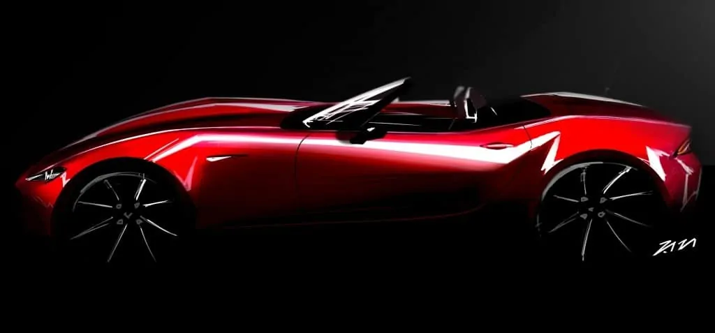
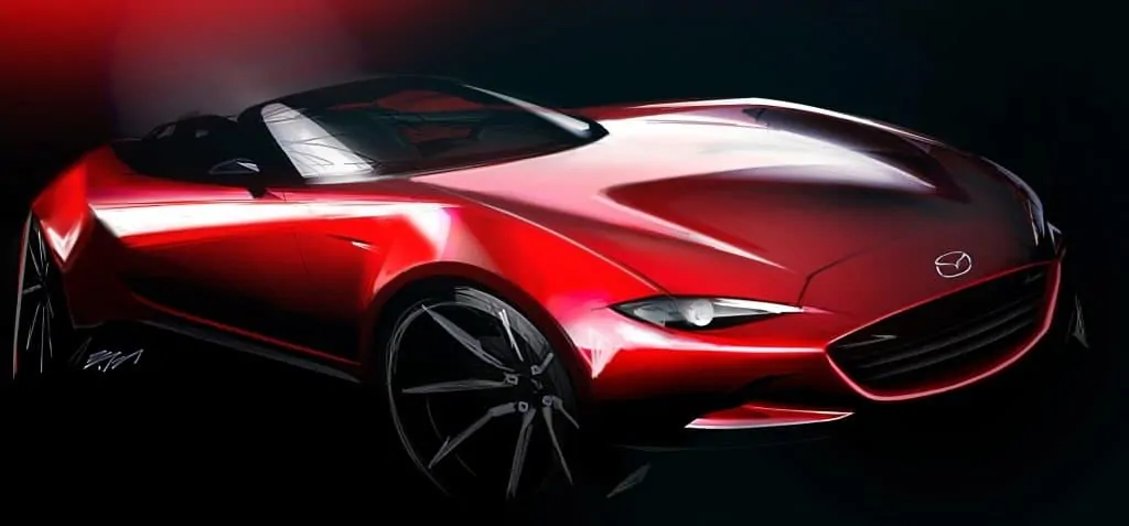
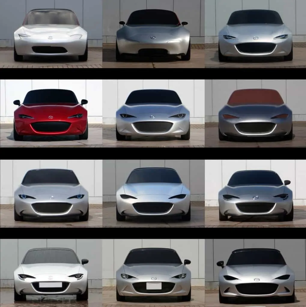
In the four-part article series, Mazda cites the key people involved in the project but also shows a number of previously unseen alternative proposals that the design teams in the automaker’s Japan, US and Europe-based studios devised.
Here are a few snippets from the series:
Back in 2011, designers from Japan, the U.S. and Europe, led by MX-5 Chief Designer Masashi Nakayama (MX-5 program manager since July 2016) and under the direction of Ikuo Maeda, Mazda’s global head of design, were tasked with redefining Mazda’s legendary roadster. Program Manager Nobuhiro Yamamoto kicked off their efforts by setting targets for what would define the next-generation MX-5—a vehicle whose size and weight they knew would be more comparable to the first-generation’s than any that had come since, with the objective to ‘innovate in order to preserve’.
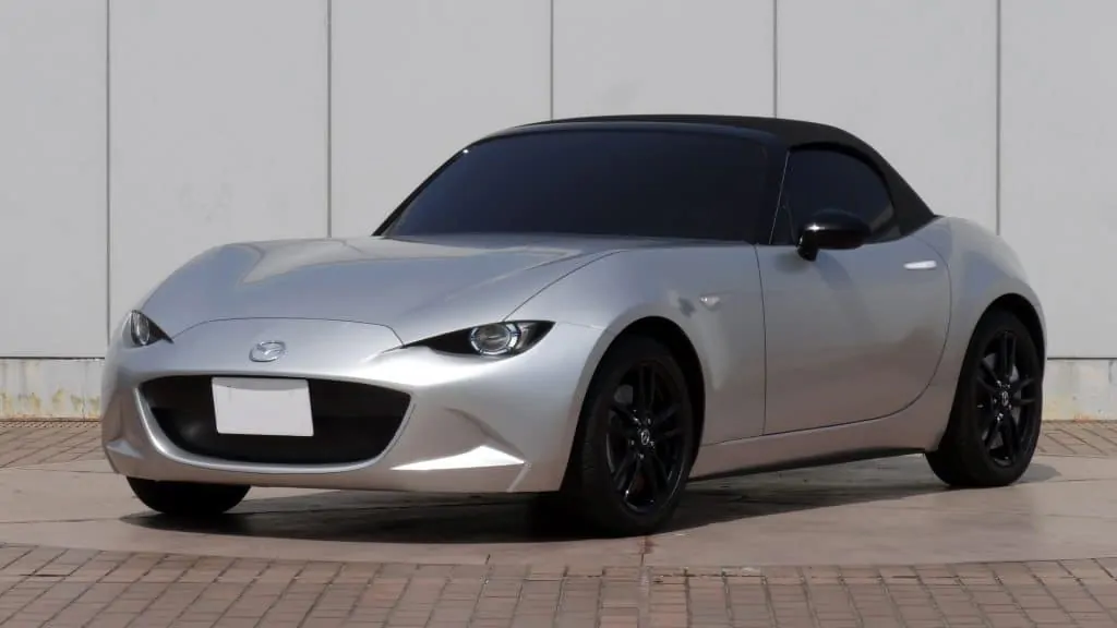
Upon setting targets, the program team set proportions of the MX-5. Rather than retaining the familiar, somewhat symmetrical shape, with the cabin in the middle of the car, the lines of KODO—Soul of Motion design called for a cab-rearward look, evolving the car’s proportions with some of the same appeal of exotic, European roadsters of yore. Designers and engineers moved the windshield back 70mm from where it had always been.
With the MX-5’s ‘hard points’ — where the structural elements of the car like the windshield would be — set, the teams were provided three objectives for Mazda’s next-gen sports car: Beautiful proportions, a roof opens and closes beautifully and details that tickle minds of enthusiasts. The teams had to create a car that complemented the KODO design language but also expanded upon it in a way that was unique to the MX-5.
“Our goal was to find a solution to reach that goal. Therefore we defined a task to ourselves, which was to satisfy seemingly conflicting elements of ‘simple and distinct image’ and ‘emotional and expressive image’ at the same time,” said Nakayama. “We made a commitment to never freeze the design until we get there. Upholding this high goal, the journey of developing this car’s design had begun.”
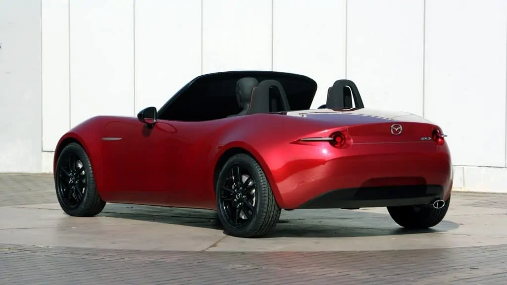
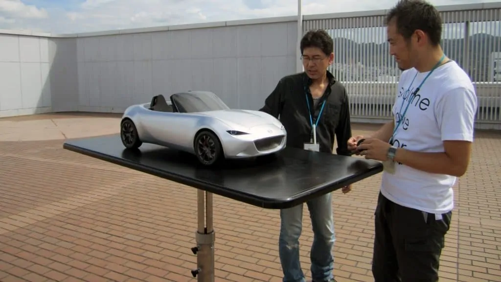
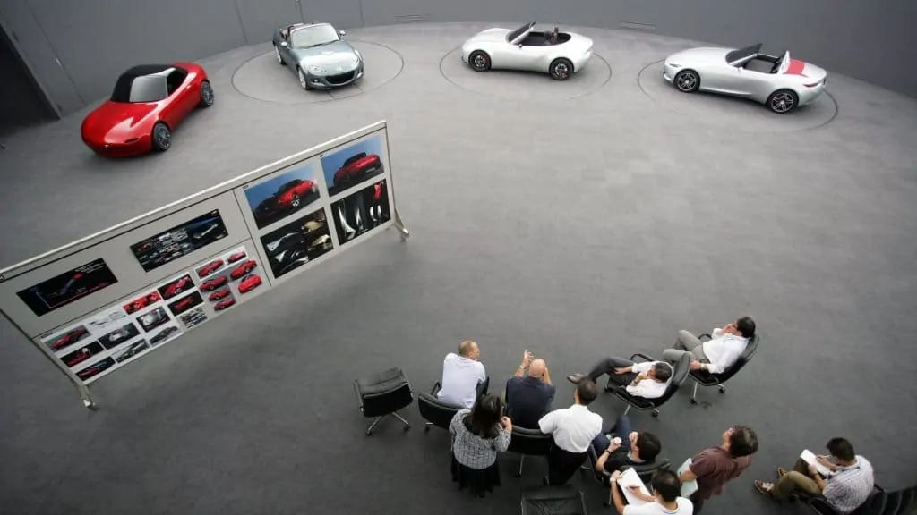
In June 2011, all of the studios submitted 1/4-scale clay models showcasing what they felt the next generation MX-5 should look like for evaluation. Each brought unique details that deserved consideration.
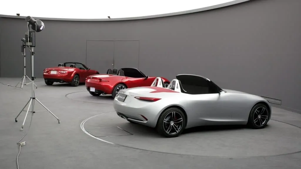
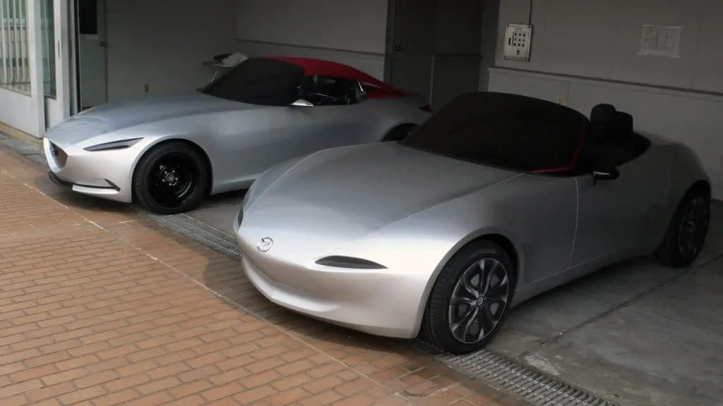
After the initial proposals, themes were narrowed down to one study from Japan and one from the Irvine, California-based Mazda Design Americas. Sharing their proposals in February 2012, they began sharpening their focus on what the production 2016 MX-5 roadster would be.
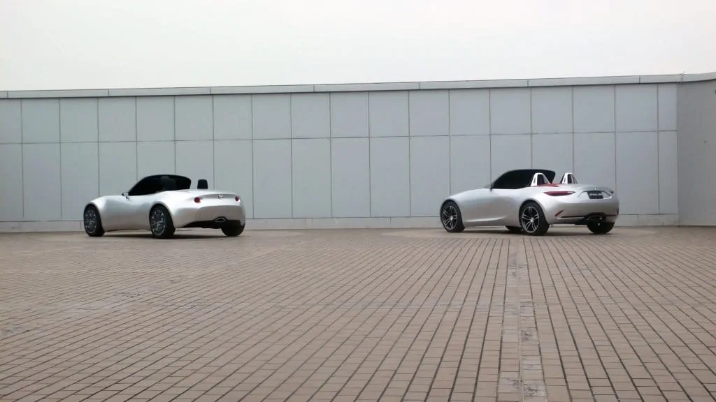
The Mazda Design Americas full-size proposal used sharp, aggressive lines to push the purity and spirit of the roadster. Mazda Design Japan’s design expressed movement through changing surface volumes. Clay modeler Yukiharu Asano worked through Japan’s Golden Week holiday in May 2012 (when the office is ordinarily closed) with MX-5 Design Chief Masashi Nakayama to hone their proposal until Asano had an “ah ha!” moment. Breakthrough. They had found their design.
When the American design team arrived in Japan to share their final proposal, both teams sat down together to go over their designs. Nakayama felt the American proposal didn’t capture raw emotional excitement in a way that would captivate enthusiasts. The U.S. team felt there was still too much of the first-generation car tied up in the Japanese proposal. Progress needed to be made to get this small, yet crucial, vehicle perfect, as it would be the car that would anchor the entire Mazda brand. The fact that the U.S. is the MX-5’s largest market was further ground for keeping the dialogue alive and open between the two design centers.
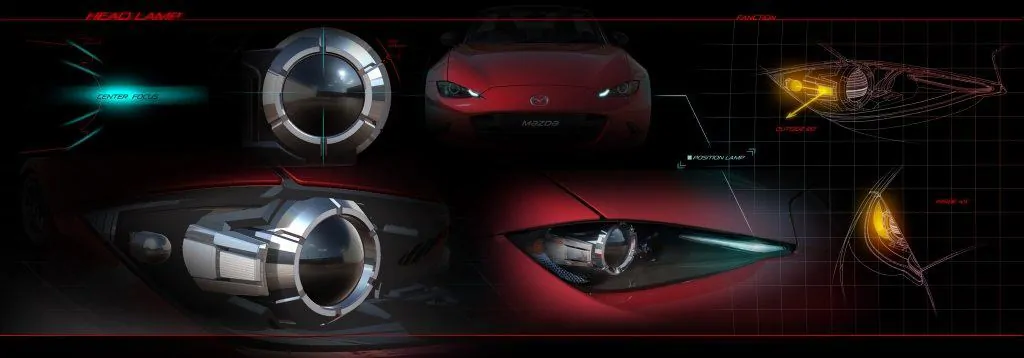
Pop-up headlights were no longer en vogue, and there was no chance they’d be coming back. But there needed to be some sort of tie to the rest of the Mazda family—simple and clean like the first-gen’s running lamps or almond-shaped like those of the rest of the Mazda family.
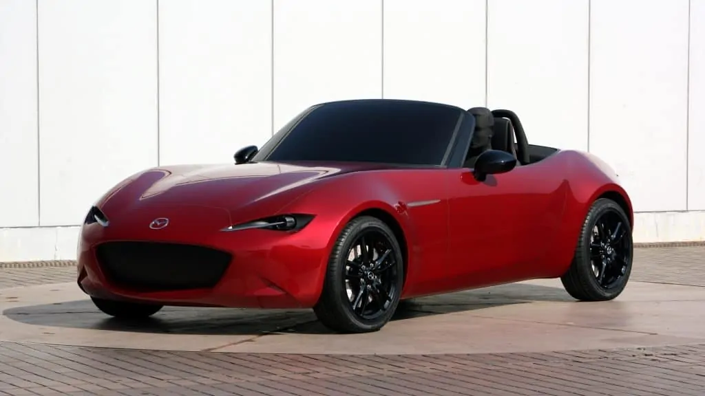
In the end, the team used cues adapted from the European proposals, giving the MX-5 an expressive face that complemented both objectives.
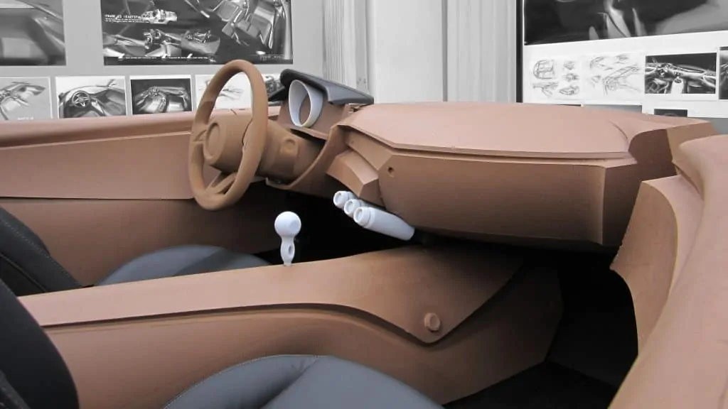
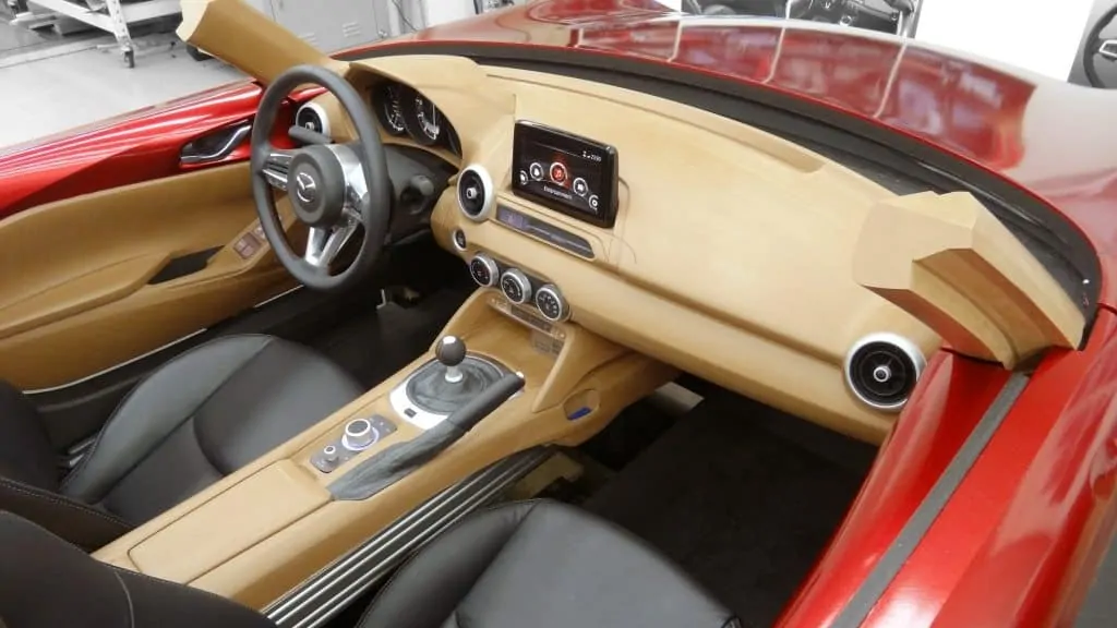
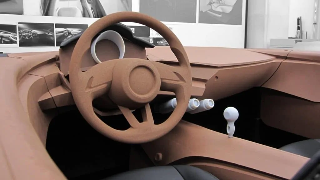
Conversations also continued to the interior, where the objectives were set around three principles: ‘No distinction between inside and outside’; ‘Must make it look light’; ‘No frills’.
Both Japanese and U.S. designers worked on an interior theme. Derek Jenkins, who was the U.S. director of the design at the time, and Julien Montousse, the current design director who was the lead on interior design out of Irvine, went to Japan to further refine the U.S.-developed concept.
The Japanese theme was realistic for production but was too voluminous given the fourth-generation MX-5’s slimmed-down exterior proportions. The design Montousse worked on was driver-focused and looked svelte, but it lacked the simplicity Nakayama and Maeda wanted.
Still, it was a start, and the Japanese team requested Montousse spend the next six months in Hiroshima to hone his theme into what would become the MX-5’s interior.
As progress continued in Japan, Montousse and Masato Ogawa, interior design manager in Japan, led the development of the MX-5’s cabin with a focus on breaking down the feeling of being contained in a car. One of the ways they accomplished this goal was to make interior panels body-colored, with the fenders feeding a visual illusion that they flowed into the car.
In some prototype ‘mules’—chopped-down third-generation MX-5s that served as testers for the fourth-generation car—designers placed body-colored interior panels at the top of the doors and plastic bumps above the front wheel wells to simulate what the driver of the fourth-gen MX-5 would see. Their goal was to show how the production car would feel to drive, visually, psychologically and emotionally.
On October 3, 2012, all of the teams converged for their final proposals, with the Japanese theme leading the way with overall direction and the U.S. and European themes providing details to make the MX-5 stand out. Mazda designers shared the goal of making a car that looked and felt uniquely Japanese, yet it was globally relevant. Mission: Accomplished.
Head over to Inside Mazda where you’ll find the full, unabridged story and a brilliant photo gallery. I’ve only picked out some choice examples.

