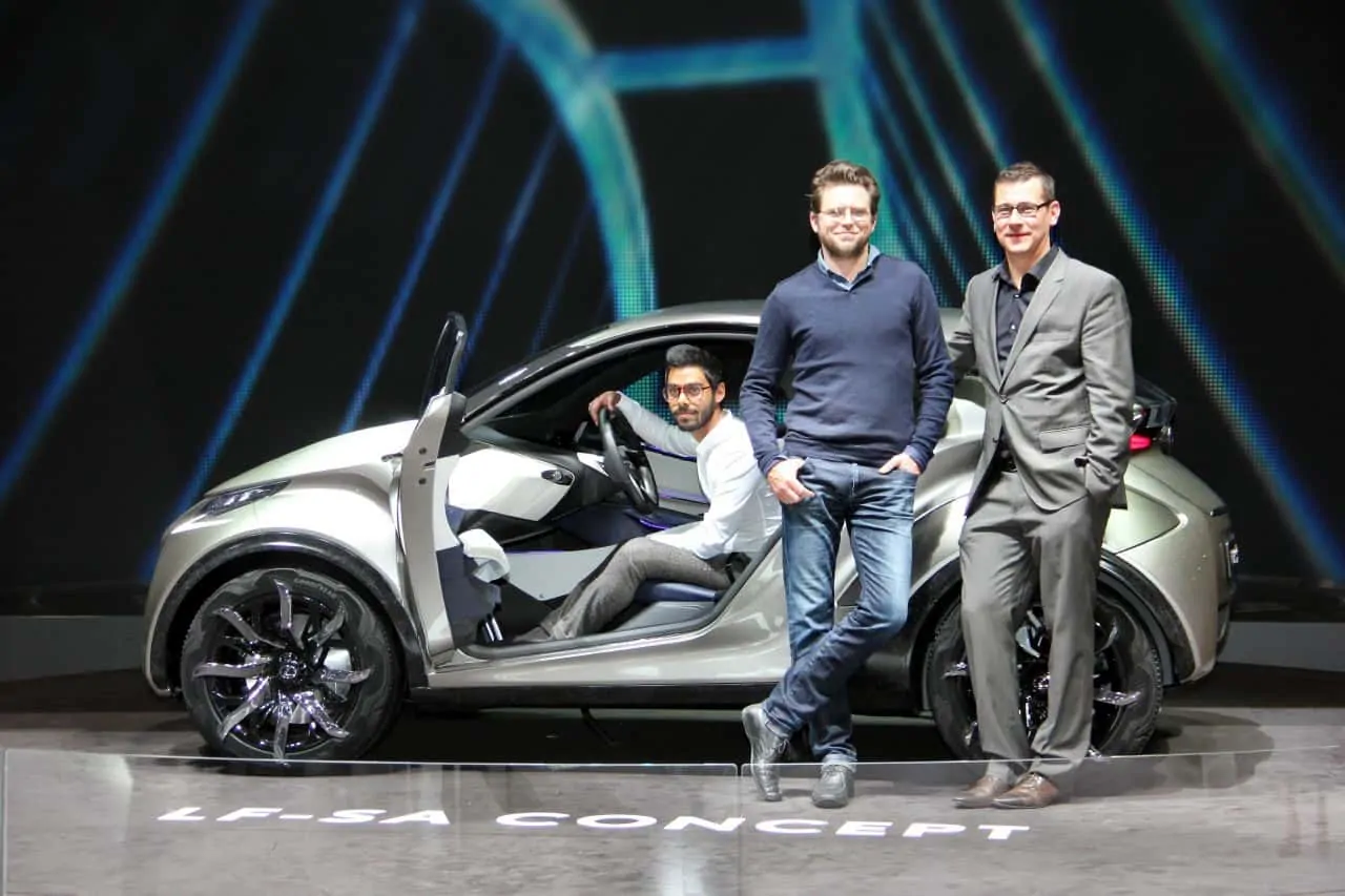
Lexus is looking to the compact segment with the LF-SA concept, a vehicle that previews a possible A-segment contender from the Japanese luxury brand. The very contemporary, albeit aggressive, vehicle was designed at Toyota’s European Design Center, ED2, in Nice, France.
“It was a study of the package — the starting point was the iQ package — we to wanted to create a very small car for the Lexus brand that gives the impression of smart sophistication,” says exterior designer Laurent Bouzige.
The LF-SA concept, roughly the size of the Toyota Aygo though slightly wider, features a very angular design and a fresh exploration of definitive Lexus design cues, such as the spindle grille. In this iteration, the grille’s angular pattern flows outwards from the central Lexus emblem, developing from a two-dimensional graphic to a three-dimensional form.

The LF-SA’s long headlamps set high on the front — with separate indicators beneath — also serve to give the car a very expressive, though polarizing, front face, that stretches over into the shoulder, expanding the width of the car.
“The problem with a small package is that it’s really difficult to make a line design, the lines are really short,” explains Bouzige. “So we decided to deconstruct the volume in order to obtain some line effect and vacuum-formed surfaces, which is why in the end it became quite angular.”
The body side of the LF-SA is therefore created from a number of elements: Its faceted surfacing shows a clear division of the surfaces, with contrast-colored panels designed to make the car appear larger than it actually is. It also fits in well with Lexus’ design ethos.
“We tried to keep Lexus fundamentals of L-Finesse, the Lexus design philosophy,” continues Bouzige, “And we were really inspired by the NX [production SUV], which is kind of the brother. We tried to think about how to make this design language more appropriate for a small car and for the future.”
There are also a number of interesting details: The matte paint on the panel below the large side window, or day-light-opening (DLO), draws the eye down to make the window appear larger and enhance the spacious feeling, while a special metallic paint has been applied to the gloss areas to break up the surfaces even further. In the shadows, it appears to lose its metallic appearance. The body is underscored by a carbon element that also runs over the wheelarches. Made from mixing a carbon fiber with a light resin, the trim panels are then finished in satin. It is a new graphic treatment to conventional, weaved carbon fiber.

At the rear, the backlight protrudes from the main volume, pushing outwards to a sharp end and a negative surface below. This was done to graphically extend the LF-SA’s roofline while also enhancing the perception of space within the interior. The rear lamps also float cantilevered off the trunk, connecting with the rear fenders to enhance the width of the car.
The LF-SA’s interior also harnesses the exterior design language with very angular forms, but it too is a progressive space. A contrasting blue and white color scheme separates the driver and passenger areas with a clear asymmetry to the instrument panel to draw attention to it ‘driver’s car’ intention.
“We set out to create an architecture that was more focused on the driver,” says interior designer Shahidul Alam. “But we wanted to do something that was more progressive in terms of luxury by pushing the boundaries of L-Finesse. Some of the key elements of design were based around the principles of crafted finesse, manipulation of lightness and material fusion.”


